Based on a recent conversation, I decided to look closer into Labour Productivity, output produced per unit of labour. My usual go-to site for statistical data on economies is OECD.Stat and as usual, they provided me with the information I was looking for.
In order to nicely visualise GDP per head of population, hours worked per head of population, and GDP per hour worked, I did a brief search for cross-platform data visualisation tools and stumbled onto Orange.
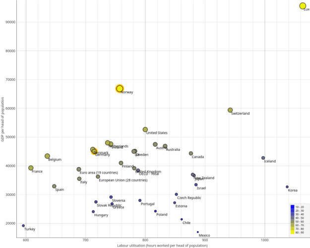
Using this very intuitive tool, I was ale to easily create the diagram I had in mind: A scatter plot of time worked vs. output per head:

This diagram is based on the data for 2013, as it was the most complete dataset with only Australia being an estimate and no gaps. The horizontal axis shows time worked, the vertical axis shows the output, and the size/colour show the productivity.
One of the two extreme outliers is Norway, the place I currently call home. So I looked more into this. One of the first search results was a research paper published by Statistics Norway, the Norwegian statistics bureau, which puts this exposed position into perspective and moves Norway closer to the productivity similar to Germany, USA, or Sweden.
The paper attributes this deviation mainly to the oil and gas income and different possible ways to estimate purchasing power parities.
Another interesting place is France which works very little but at a decent productivity, achieving average GDP per capita. Sounds like a good place, if one values time more than income or things.
A positive note for the countries of low productivity is, that many of them have been leading in productivity growth in the recent years.

Well, enough of this nerdy stuff 🙂
Enjoy your Sunday
